THE VINEYARD BRIDE GUIDE | SEATING CHARTS
Today we’re excited to share a fun Style Review within our Vineyard Bride Guide Series, as we focus on seating charts! With endless inspiration at the fingertips of bride’s planning their big day, we wanted to breakdown some of the styles/trends we see most in our features here on Vineyard Bride. Be sure to let us know what resonates most with you!
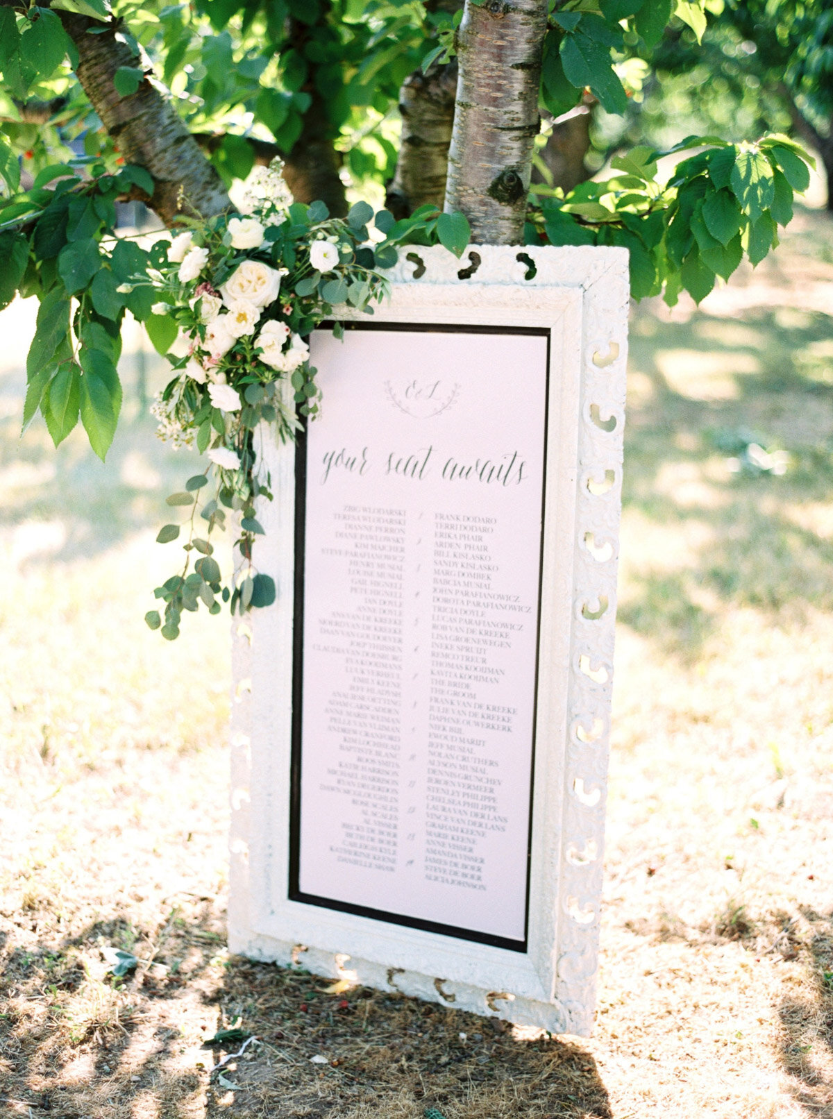
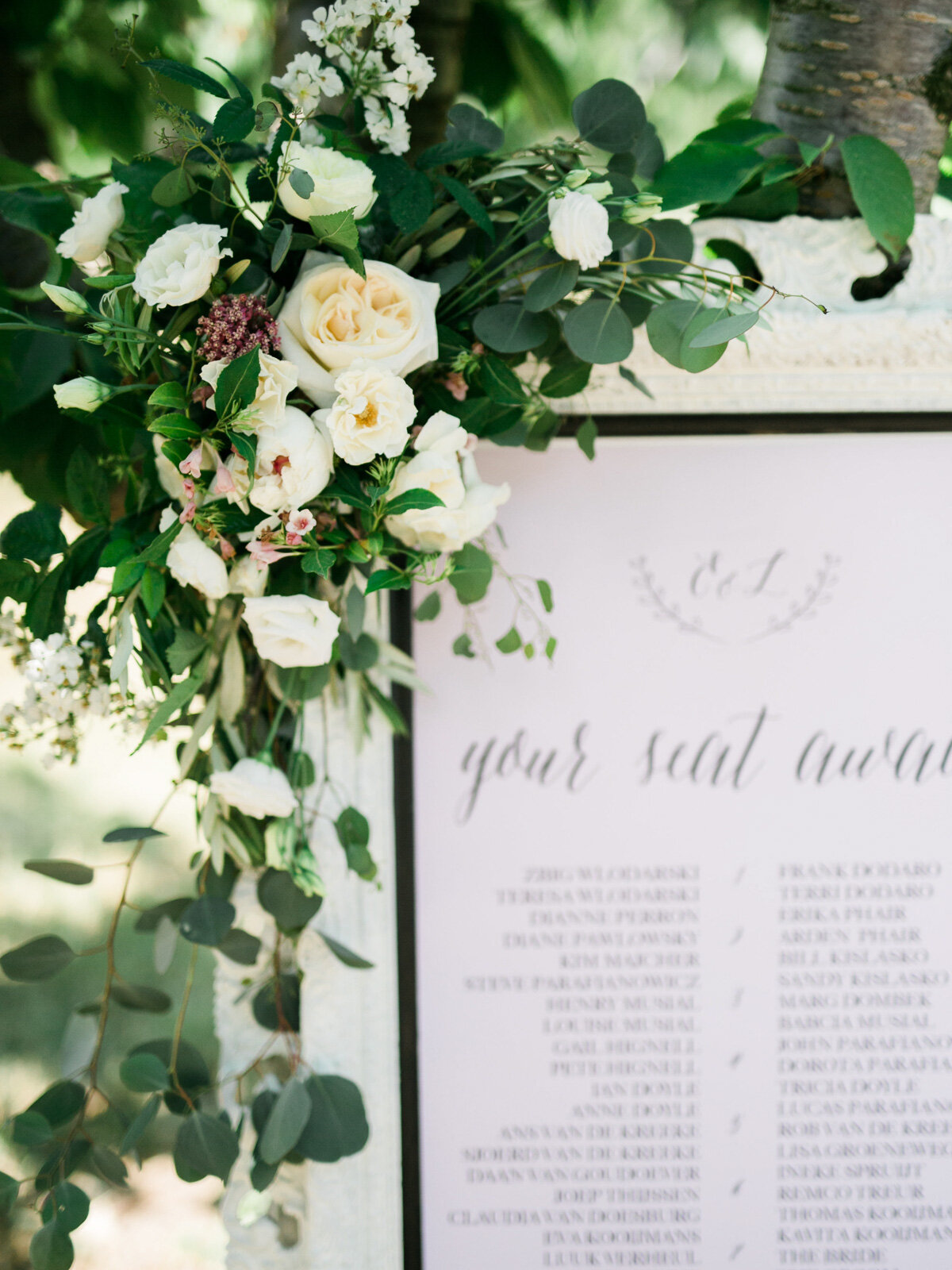
Classic + Romantic
We’ve said it before and we’ll say it again, sticking to a classic design will always be in style. We love the elegant frame with floral detail to soften things up, and how the font choices can play throughout all the stationery details surrounding the day.
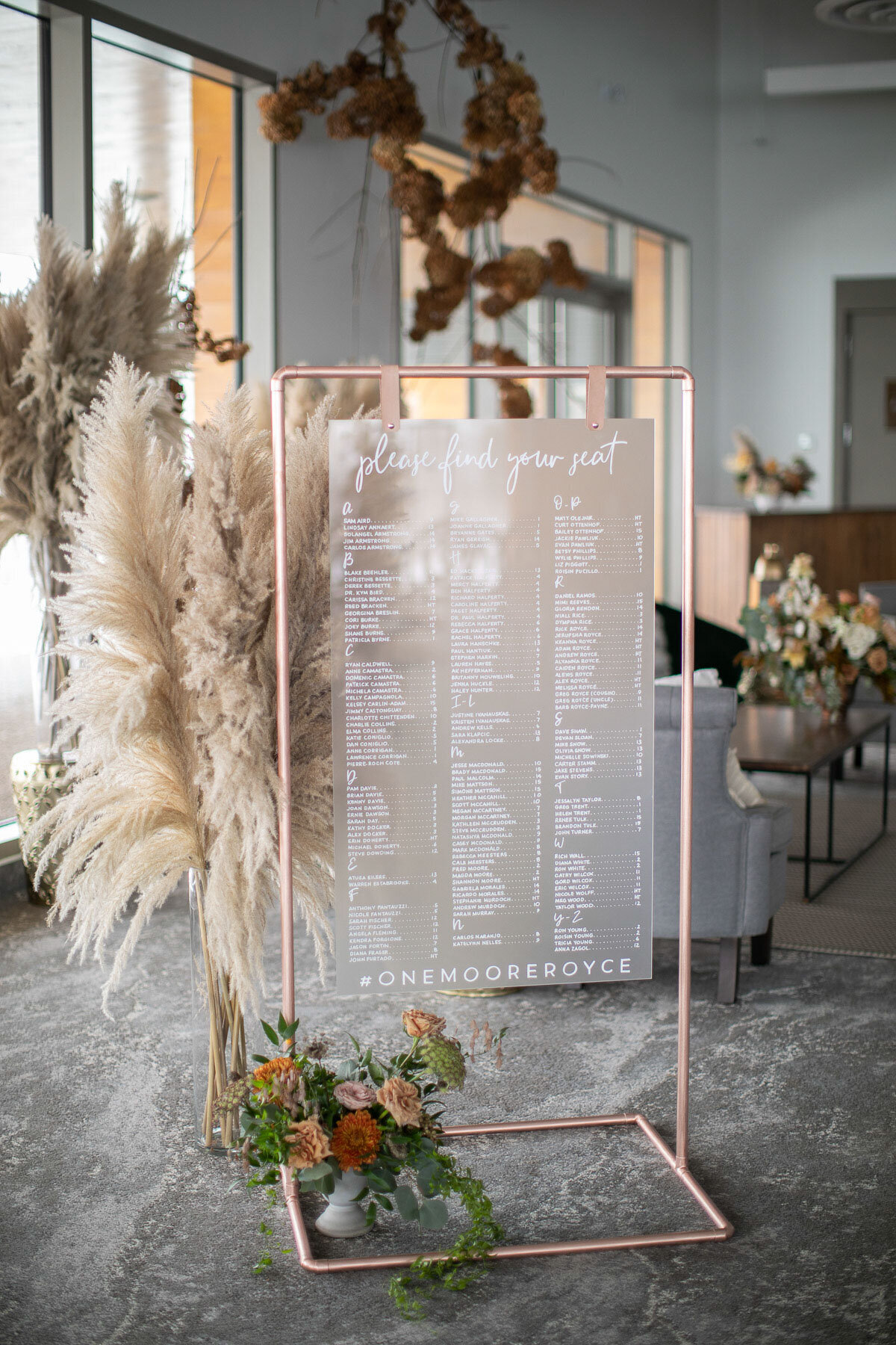
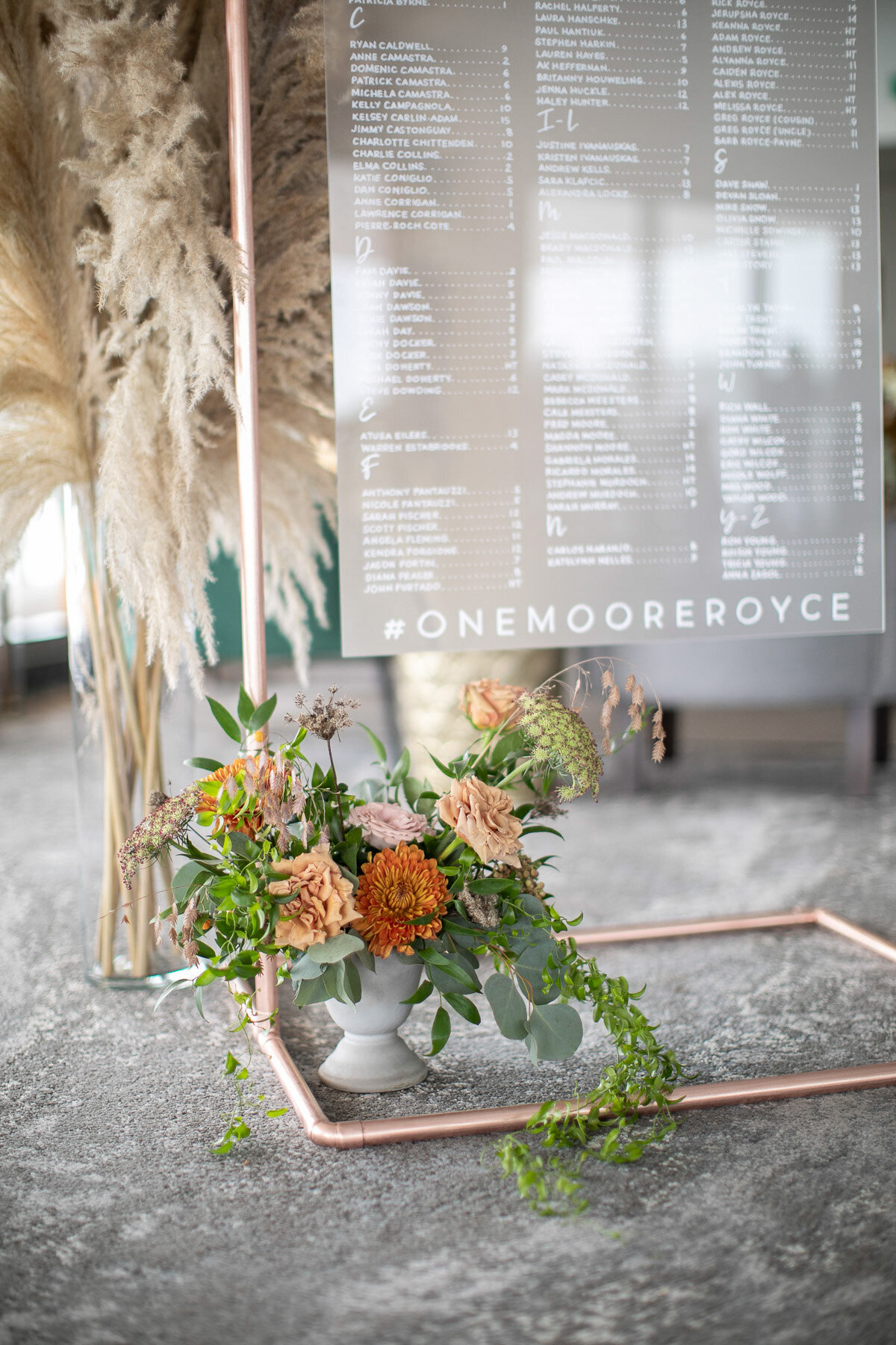
Clean + Modern
The use of acrylic signage has garnered some attention over the last few years, and has really come into its own as wedding focal point! The clear, clean lines provide an interesting point of view, and it’s always fun to throw in an element of surprise that is sure to wow guests!
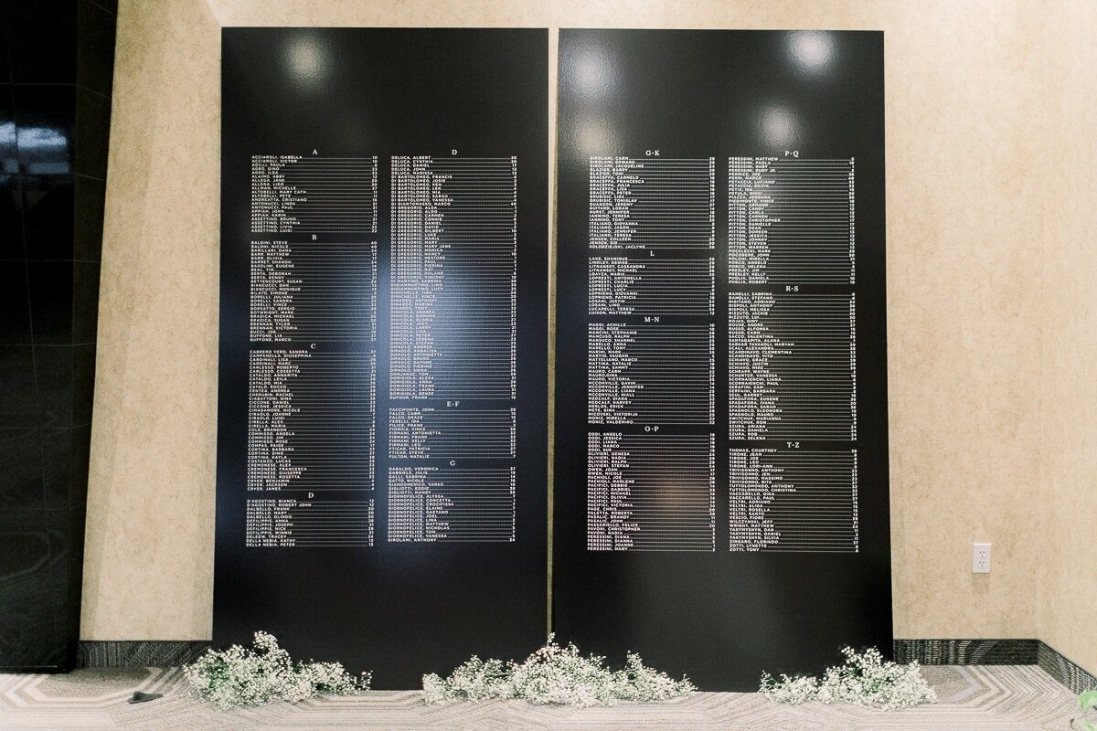
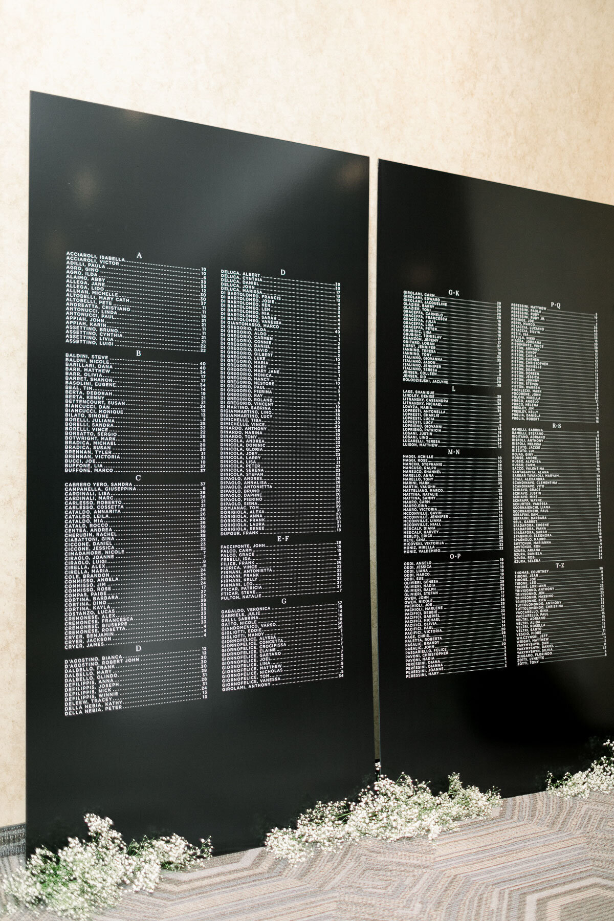
Black + White
In a completely different classic vibe, the option to go black + white is bold and highly visual. This style works particularly well with large guest counts, as it’s alphabetized layout is practical and organized, while still being impactful.
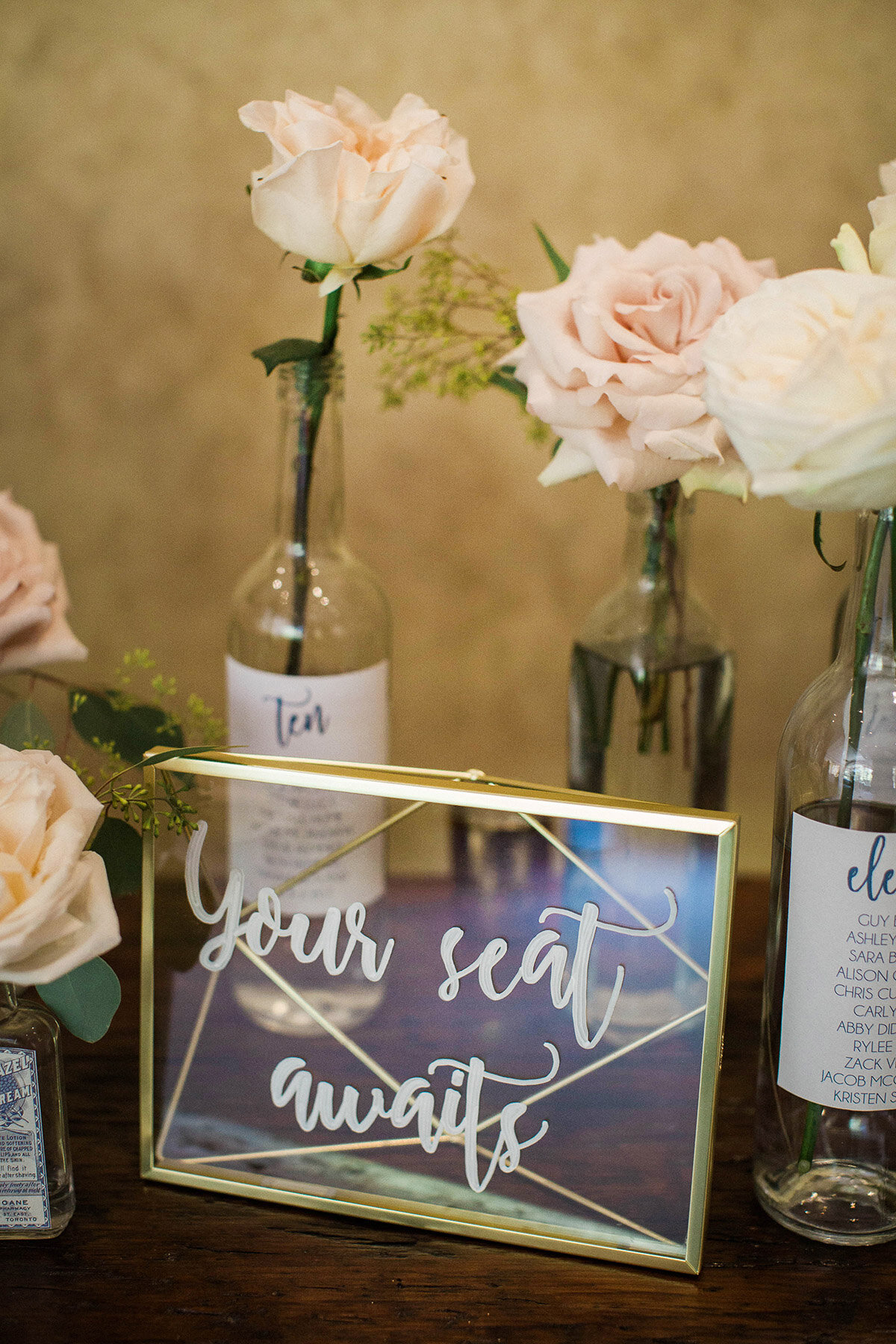
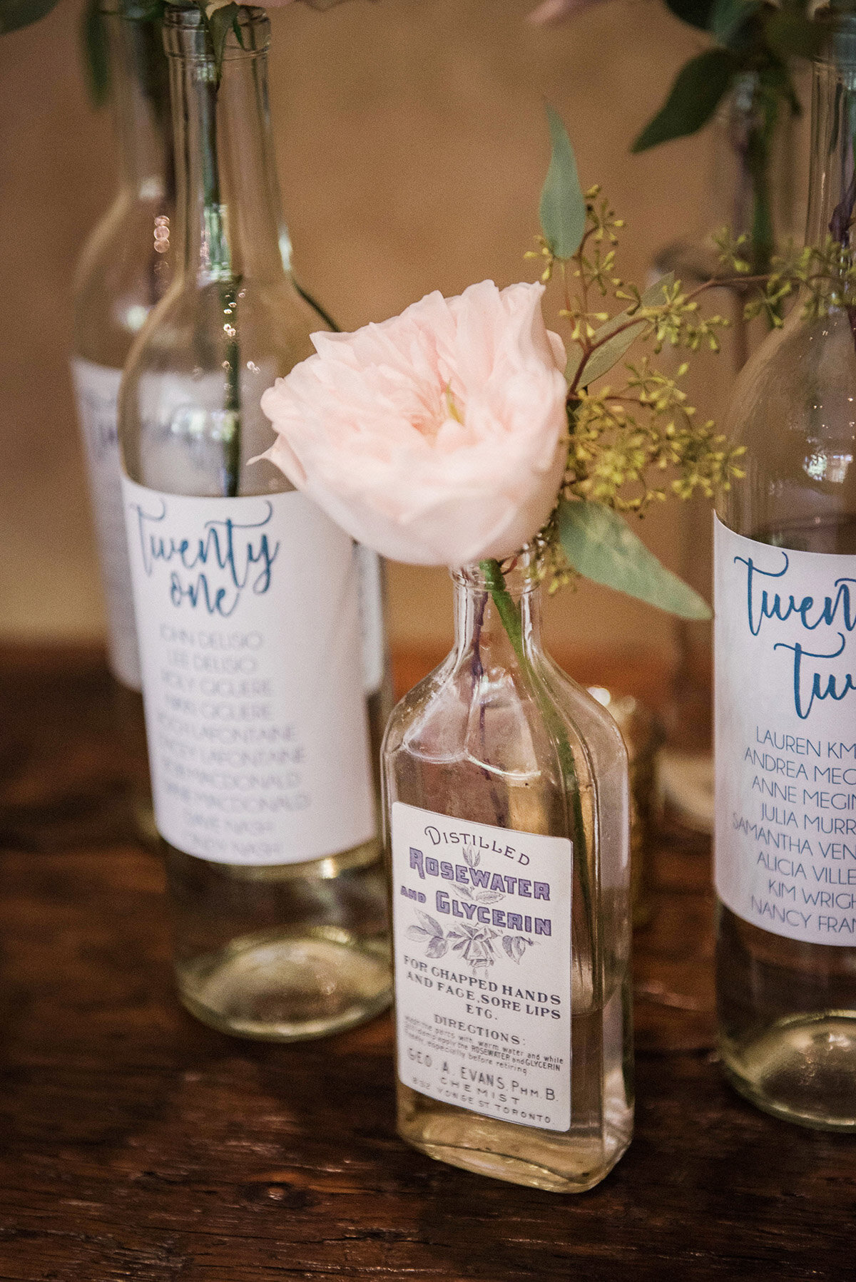
Rustic + Charming
Niagara will always lend itself well to rustic, charming details and we’re always on board when florals can be incorporated. The simple glass bottles adorned with labels provide an interesting moment that gave guests an added level of fun!
Image Credits:
Image 1: Stationery: Chelsea Peters Illustration | Photography: Andrew Mark Photography
Image 2+3: Photography: Photos by Caileigh
Image 4: Photography: Ally + Nicholas | Planning: Fete Events
Image 5+6: Seating Chart: Kat Event Rentals | Photography: Philosophy Studios
Image 7+8: Seating Chart: Simply Sealed | Photography: Elizabeth in Love
Image 9, 10+11: Seating Chart Wine Bottles: Bride DIY | Photography: Nataschia Wielink Photography | Planning: Amanda Cowley Events

